
Vector embeddings have emerged as one of the most important tools from the deep learning revolution. The remarkable ability of deep neural networks to turn complex data such as images and text (and more) into semantically meaningful vectors in a kind of abstract concept-space has unlocked all manner of interesting applications. A crucial breakthrough has been the development of techniques that allow such neural networks to be trained in a self-supervised fashion i.e. without the need for human-created labels. These “pre-trained” models–foundation models, if you will–can then be used as feature extractors in downstream models and applications. In this blog post, we explore the application of one such model [1], pre-trained on Sentinel-2 imagery, to the downstream task of change detection.
The proposed approach has the following advantages:
- The change detection is not pairwise (i.e. based on the comparison of two specific timestamps) but rather takes into account the entire history of the region.
- It is robust to natural seasonal variation.
- It will naturally get better with time as more images are collected.
- It uses a general off-the-shelf pre-trained model (i.e. not specifically trained for change detection) and does not require any additional training. One may easily swap out the model for a different one.
- The model makes use of all 12 Sentinel-2 L2A channels.
We apply our approach to detecting changes from three recent natural disasters: the 2022 floods in Pakistan, the 2023 earthquake in Turkey, and the 2022 Mosquito wildfire in California. We begin by building up the technique step by step, using the first of these disasters as a running example.
What is a vector embedding?
A vector embedding is simply a list of numbers (i.e. a vector) produced by a model in response to an input (such as an image) that corresponds to a compressed representation of everything that the model thinks is salient about that input. On their own, the values in these embeddings are not meaningful to humans, but a lot can be gleaned from how these values relate to those in other embeddings.
The animation below gives a taste of what these embeddings look like. Our model here is a ResNet-18 so the embeddings are vectors of length 512. For illustrative (and aesthetic) purposes, we represent these vectors as line plots in the animation below. We notice that there are two instances of flooding in the period from 2017 to 2023–in September of 2020 and 2022 respectively.

The most important thing to notice here is that similar images have similar embeddings while dissimilar images have dissimilar embeddings. This may be seen more clearly in the stills from the animation above shown below.


Mathematically, vectors being similar or dissimilar to each other means the points that they represent in some (512-dimensional, in this case) space being close to or far away from each other. This suggests that one can detect anomalous or atypical embeddings by their proximity (or lack thereof) to normal or typical embeddings. However, this can get tricky when what is typical varies throughout the year.
What makes change detection tricky: seasonal variation
One way to visualize the proximity between points in high dimensions is through a t-SNE projection as shown below. If we restrict our investigation to just the months August through October across the years, the anomalous points very clearly stand out (the left plot). However, the distinction is not as clear if we include all the months (the right plot).


That is to say, the distribution of these embeddings (if we include all the months) is multi-modal with the mode changing throughout the year. So, ideally, to determine if an embedding is anomalous, we have to compare it against whatever the typical embedding for that time is.
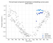
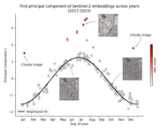
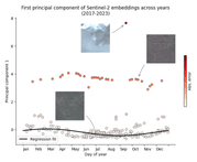
We can see the seasonality more clearly if we perform principal component analysis (PCA) on the embeddings and then plot the first principal component against time, as shown below. We can also see that the instances of flooding seem to break the trend by causing a “jump” in the series. The disruption of the trend will be more clearly seen in the visualizations in the next section.


Modeling the seasons
Another way to visualize the seasonal trend is to overlay the embeddings from all the years on top of each other, as shown below. We can see that similar times of the year have similar embeddings across the years and the flood embeddings stand out even more starkly as anomalous. It is also interesting to note the sparsity of points in the Jul-Oct period; this matches up with the summer monsoon season in this part of the world, which naturally leads to fewer cloudless images.

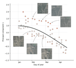
The above figure also immediately suggests an obvious way to detect outliers: fitting a regression curve to the data and measuring the deviation from it. Rather than attempt to model the trajectory of all 512 dimensions of the embeddings over the course of the year, for simplicity and interpretability, we model only the first principal component.
It is simple to fit a periodic curve using linear regression if one uses the features sin(t) and cos(t) instead of just t. Additionally, the regression needs to be fairly robust so that it can fit the dominant trend and not be sidetracked by outliers. To achieve this, we use the RANSAC algorithm. The result can be seen in the figure below.


Et voilà: we can now easily detect atypical images based on how much they deviate from the regression fit!
Detour: what’s going on in the top left of the previous plot?
Speaking of deviations, it is interesting to note that the embeddings near the start of the year seem to be split into two modes that tend to come together as the year progresses. We can zoom in and inspect the actual images to investigate what is going on (see figure below). Doing this reveals that there are indeed two modes! It seems that in the early months, the amount of vegetation varies from year to year. Now why is that? Random chance? Changing climate? Shifting agricultural practices? These are the kinds of interesting research directions this kind of analysis can reveal!

We now apply the same approach to the other two natural disasters.
Case study #2: 2023 Turkey earthquake
On February 06, 2023, parts of Turkey and Syria were struck by a major earthquake with significant aftershocks following in the days after. One of the cities most affected was the city of Antakya, Turkey.
Gathering the historical embeddings for (the Sentinel-2 view of) this city, applying PCA, and plotting the first principal component, we observe the following curious trend:

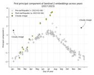
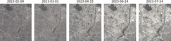
It appears that the embeddings do not begin to diverge until some months after the earthquake. Examining the actual images from this period (see figure below), it seems like the initial destruction from the earthquake does not register at the resolution of Sentinel-2’s sensors–and therefore, does not significantly perturb the embeddings–but the subsequent clearing of rubble, demolitions, and reconstruction does.

Fitting a regression curve as before, allows us to detect this change in an automated fashion based on the deviation from the curve.

Case study #3: 2022 Mosquito wildfire, California
For our final example, we apply the same analysis to a patch of land that was affected by the 2022 Mosquito wildfire in California:

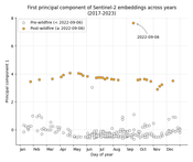
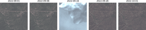
Based on the plot above, it appears that the fire significantly altered the appearance of the landscape. The actual satellite images (see figure below) confirm this. We can see that the fire has burned away all the vegetation, causing a drastic change in color. We also see what appears to be heavy smoke on the day (Sep 16, 2022) that the fire was active in this area.

Finally, just as before, applying regression allows us to detect these changes automatically:

Limitations
One obvious limitation of this approach is the need for cloudless images. Any cloud cover at all can mess up the embeddings and if there are a significant number of cloudy images, they may significantly influence the PCA and the regression. This means that this approach might not be well-suited to geographical regions where cloudless days are scant.
On the analysis front, the use of only the first principal component is a major simplification. We are throwing away a lot of potentially useful information by excluding the other principal components. Using a less lossy dimensionality reduction or modeling all dimensions of the embeddings, if feasible, might help us find even more fine-grained changes and patterns.
Concluding thoughts
We have presented a straightforward approach to geospatial change detection that makes use of a foundation model to convert satellite images into high-quality vector embeddings and more traditional machine-learning techniques to detect outliers in those embeddings. The approach is able to handle seasonal variation and does not require a user or heuristic to pick exact timestamps to compare.
Additionally, this approach is highly flexible. We can apply it to other kinds of satellite imagery (e.g. SAR). We can swap out the model for a different one. We can even modify the analysis to make use of a different kind of dimensionality reduction, or regression, or to perform a different kind of analysis altogether–for example, comparing the “shape” of entire years to each other to find anomalies or trends.
Looking more broadly at the evolving AI landscape, the shift towards the use of general-purpose foundation models in all domains (including geospatial) appears clear, and presents many opportunities. The need for high-quality foundation models covering all the various geospatial data modalities cannot be overstated. At the same time, as this work demonstrates, there is an opportunity in rethinking old approaches to traditional tasks under this new paradigm.
At Element 84, we are at the front and center of these developments and are committed to lowering barriers to entry for others. This work was made possible by our Raster Vision library and STAC API Earth Search, both of which are free and open source. If you would like to get started with the kind of analysis shown here, this Raster Vision tutorial is a good starting point.
References
[1] Wang, Yi, Nassim Ait Ali Braham, Zhitong Xiong, Chenying Liu, Conrad M. Albrecht, and Xiao Xiang Zhu. “SSL4EO-S12: A Large-Scale Multi-Modal, Multi-Temporal Dataset for Self-Supervised Learning in Earth Observation.” arXiv preprint arXiv:2211.07044 (2022).